I've been working on this canvas off and on for a long time. So long that, in fact, when I started it I had a definite plan in mind, but I can't remember what it was! So, I've pressed forward and am pretty happy with it. The images are photographs I took of street art in Paris. Fiber paste circles and triangles; cloth buttons, black braid, pen nib and ornate charms; painted red circles and yellow square added for dimension. But it doesn't feel done to me. I feel like I need something to pull it all together. I'm thinking something in white maybe? And I'm not really loving that shade of blue; it's very dark and there's so much of it.
Ideas gratefully appreciated!


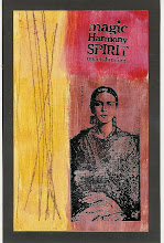
![LEAP [into lightroom]](http://learn.kimklassen.com/wp-content/uploads/2015/12/Kim-Klassen_20151223_6459.jpg)


13 comments:
I would try something under the circles that have the moon and the star .. maybe more of the ric rac?
I think the colours a great - there is a vibrancy to the whole piece so they suit in my opinion.
what I see in my mind for a Rinda piece is some texture over the blue, under everything else - stamped or paint effect.
i say you need to "wrap it up" ... a white ribbon all the way around the perimeter of the canvas, maybe??? literally tie it together
Mariana (who is horrible with this type of art and her suggestion should probably be dismissed) :D
I do like the idea of "tying it all together" and I do also love that shade of blue. It has an admirable strength to it.
I also really like the blue.... though there is a lot of it..... maybe it could be toned down a little in parts.....and the idea of 'tying it all up' seems a good one
I also really like the blue.... though there is a lot of it..... maybe it could be toned down a little in parts.....and the idea of 'tying it all up' seems a good one
I also like the vibrant colors. My first reaction was the same as Helena's--that some subtle texture on the blue might soften it a bit, but I think that might be very hard to do at this point. I also like Amy's suggestion that something in the larger blue space under the moon and the star might be all you need.
I also agree with Helena - maybe some sort of texture to tone the brightness down a bit. Otherwise, it's a lovely piece and I really like the pictures you have used...kind of Mary Poppins-ish. ;o)
I think it is funny how at times we just look at a piece and think something more, like my last one! To me I love the vibrance of this canvas. I agree something is needed in the more open areas. I see that you used a little black trim towards the top and Maybe add a little black?
I love the blue and agree with a couple of the others that some texture on the blue would enhance it.also, thank you Rinda- I received my package from you safe and sound today x
I think it's beautiful Rinda :-) I suppose if you wanted to add anything, you could put a little something extra in the blue area Amy's mentioned and/or something very little on the yellow section with the wavy lines? But to be honest, I think it's great as it is! xx
You have so many wonderful stamps, I think maybe a couple or appropriate ones would just finish it off. But it feels very wrong for me to be giving you advice so please feel free to ignore!
i love what you have done and think the blue is striking. i would add some white, in lines or stripes, going different ways in the blank blue areas and also around some of the edge. can't wait to see what you decide to do.
Post a Comment