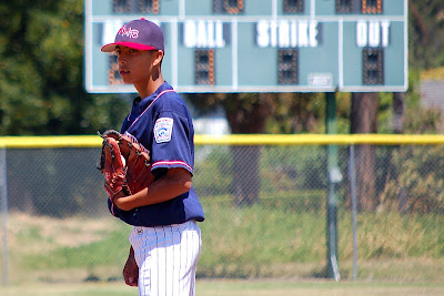
I've been mired in hours of editing and cropping photographs that I let pile up over the summer. For the most part, I do a quick crop, hit "auto enhance" and move on. But I spent more time with this photograph because I really liked the way the scoreboard's "Ball, Strike, Out" could frame the whole world of being a pitcher. I love the way Henry is lost in thought (I think he has his tongue stuck in his cheek) and you can see the ball peeking out of his glove. I have lots of lovely pictures of him pitching, but I love the way this captures him as "a pitcher." And it all came about in the way I cropped the photo. Might make this my lesson of the day: "Photo cropping can make a big difference." Got any good photo cropping stories or tips to share?
In other news, I found the happiest little bit of video on a blog the other day. Go to this link and watch the video. It's about dancing and travel and happiness. It totally brightened my day.
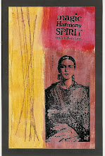
Finally, I've been thrilled recently to receive two bits of design recognition: one from the Stampotique Designers Blog for this altered book spread and one from the Gingersnap Creations blog for this mini album. I'm featuring the badges on my side bar. The blogs are very different - the first very edge; the second very vintage - but I really like both of them. Check them out if you get a chance.
Friday, September 10, 2010
Subscribe to:
Post Comments (Atom)


![LEAP [into lightroom]](http://learn.kimklassen.com/wp-content/uploads/2015/12/Kim-Klassen_20151223_6459.jpg)


7 comments:
There is a lovely intensity to this shot Rinda and it certainly is a story-telling photo.
I find cropping a challenge sometimes and presently I'm trying to frame my shots how I want them to look - that's not always feasible or easy! I find this is another area where digital scrapping helps - when you use a template the cropping is set so I find that leaving plenty of room in the shot to begin with is important.
I'm going to go and check the links for today now :-)
I really love the photo of Henry, Rinda. It's awesome!!!
And congrats on your well deserved recognition on your designs. :o)
Have a great weekend!
You certainly have some fantastic photos of your boy! He is totally absorbed in this one, it really speaks volumes. I love the way the background is blurred enough to not distract from the focal point but clear enough to see what it says. Brilliant.
Perfect cropping, that's a super photo :-) No tips to offer I'm afraid! I just play around with a shot till it looks 'right'...
Congratulations on your well-deserved recognition xx
I think that's an excellent lesson - sometimes it really is all in the crop. I always have a look at Picasa's suggested crops for my photos to see what that throws up.
How wonderful to have your work recognised and introduced to a wider audience :)
Congrats on the recognition; it is certainly well-deserved. This is a wonderful photo of Henry. I try to frame my shots the best I can with my DSLR, but have to remember to leave a crop space with my point and shoot. That said, I still play around with different crops on certain photos. Sometimes a square crop is so much more effective that the traditional 4X6. I also crop to better place my focal image using the rule of thirds. I did that recently for a photo of a sailboat on Cayuga Lake and it really made a huge difference.
Really gorgeous picture, Rinda!
Post a Comment