

It's good to be back from my trip, sitting in bed, cruising a few of my favorite blogs again and posting here. Work has been insane for me, and I've got a few more days of intense work before I can really relax and enjoy the final run-up to the holidays.
Thanks to all of you for the outpouring of compliments on my blog. I really appreciate all the comments! I think it's true that one of the thing that sets my blog apart is my artwork, and I'm thrilled that you all like it so well! Therefore, I thought I'd do a nice arty post today. Before I get to that the winner from last feedback Friday is . . . Lizzie! Email me your address at rinda1961 at yahoo dot com. I'll be sending you one of my Tim tags to enjoy! Mel, mea culpa, your prize is not yet in the mail, but will be soon.
Now, on to the art . . .
Last summer, I took a great class offered by Judy Wise, who is a whiz in creating on plaster. She demonstrated (and we created on) three different types of plaster backgrounds. The first was simply plaster of paris. We embedded some designs in it and then went from there. I used it to complete a piece called "home maker," which I blogged about earlier here.
The second surface was layers of joint compound (think dry wall paste) alternating with layers of paint and gesso. There was lots of texturizing and sanding between these various layers, all with an eye to building up and revealing different layers. I made "Pastel Abstract with Art" in the class. I found it a difficult process. Many of the other students created beautiful abstract pieces. I was reasonably happy with mine after I etched a word in it.
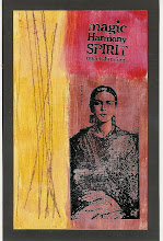
Once I got home, I was determined to give the process another try. This time I worked in a color palette that was more in my style. I was pretty happy with the background but still wanted to add some collage elements. I used a heritage photo from my collection to create this piece, titled "Chihuahua Memories." The photo is from the early 1900's and was taken in Chihuahua, Mexico. I really love it and hope you do, too! The third plaster surface was redi-wrap, which I have really fallen in love with. More about that, soon!


![LEAP [into lightroom]](http://learn.kimklassen.com/wp-content/uploads/2015/12/Kim-Klassen_20151223_6459.jpg)


6 comments:
I actually like both of these Rinda - but, I can see why you prefer the bottom one - working with colours and photos that mean so much to you always makes you feel better about the finished piece.
Interestingly, what you mentioned about the class stikes a chord with me - when my local scrap store was open I would take a class every now and then and I always came away feeling frustrated if we had to work to a prescribed colour palette or we were expected to copy the page used as an example of a particular technique. I think we all need to mark our own work with our own brand of individuality.
I think we probably all relate to what you say with colour choices....I'm sure most people have colours they feel more comfortable with.
I love the second one....as I too prefer the addition of the collage element...I love the way you work so often with heritage photos....must try to do so more often myself.
Love them both - but especially the second one :-)
And - congrats to Lizzie :-)
And - no problem hun, I know you've been busy and I'm a very patient person ;-)
I like both of them as well, but much prefer the second one. The addition of the photo makes it a much more interesting piece as well as the color choice. Like Amy, I used to take a lot of classes--usually card making-- and frequently was disappointed with the outcome. I usually learned something in the process, though.
I like them both too. And you're right..I love seeing your art on your blog. I wish we had somewhere here to take hands-on classes.
Ooh, a prize! I finally caught up with this... it's been too busy here - sorry Rinda.
Thank you for picking me... I have e-mailed you my address.
I like the plaster collage idea by the way. I prefer the second one myself. The colours and collage just work better, though I do like that little hint of something peeping through on the "Art" piece. I would think it looks more textured in "real life" though?
Post a Comment