Lucky in Love (art journal page)


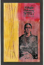
I posted these two together because I think they are interesting to view in tandem. Although they both have the same focal point, similar layouts, and both emphasize black & white, they have such different color palettes that they don't really feel like a "set" to me. What do you think?
The journaling on the top one is backward looking for me "She never knew if she would be lucky in love until she found the the confidence to be herself and wait." The journaling on the bottom pages looks to my future: "Her long term plans definitely included moving to the City with him, late nights and the theater, drinking martinis in slinky dresses and otherwise enjoying their empty nest years." And, yes, that's definitely my long term plan!
Coming soon: Class Reviews of Dina Wakley's Art Journal 103: Color and Composition and Shimelle's True Stories.


![LEAP [into lightroom]](http://learn.kimklassen.com/wp-content/uploads/2015/12/Kim-Klassen_20151223_6459.jpg)


13 comments:
Both are striking in look and meaning.I really like the human figure outline you used in all three.
Agree that the colours make them look more different than the same - an interesting finding.
Both are amazing and I love how the colors add more interest!
I love these,Rinda.....very powerful.
These look fabulous...I am especially drawn to the red one...as I am always drawn to red..but both are great! Is this one of the online classes she offers???
i love all the little details in each one. the "lucky" one is more striking and eye catching so, although both are great works, they do not seem like a pair (to me.)
Wow, Rinda, I love these pieces. From the layering to the sentiments, they are awesome. My fav is the first one - love the elements you chose with the dance steps and bingo card. xo
I, too, am particularly drawn to the black and red one (favorite combination) but I think both are striking. I love your future plans, and as an empty nester, have to say my life is nothing like that! :-)
These are beautiful! I love the different feel of each from teh colors
I've been scrolling up and down and looking at both of them several times. I love the details and the different feel from them. We were just talking yesterday about tentative plans for when the kids leave home - seems hard to believe we've come this far.
I too have been scrolling up and down looking at them and comparing them. I think they both have a very different feel, but the figure pulls them both together as a 'set'. My favourite one is the green one - beautiful.
I see my daughter in the first post and myself in the second and I love them both! You manage to incorporate so many appropriate sentiments into your pages - fabulous!
I am always so excited to come here and see what you are up to! These are amazing. The cards in "Lucky in Love," really pop and draw the eye right in for a closer look! Love them both!
Striking pages! Wonderful!
Post a Comment