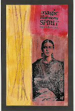
I'm working on Dina Wakley's "Work Outside Your Journal" challenge, designed to get art journalers to work on canvas or other backgrounds outside their journals. The goal is to do two a week during the month of August. Here's my second canvas for the first week of August. It's a 12x12 canvas, on which I have created a patchwork of painted plaster pieces and added an image. I'm not really sure where to go next, and I'd love ideas. I have made one other similar piece, which you can see here. Thanks in advance for your ideas.


![LEAP [into lightroom]](http://learn.kimklassen.com/wp-content/uploads/2015/12/Kim-Klassen_20151223_6459.jpg)


12 comments:
I am either going to frustrate you or please you no end - I wouldn't add anything else at all, I really like the blocks of colour, and I know you like to journal so I'd consider writing underneath the image or in the orange square top right. The simplicity is beautiful :-)
I'm with Amy here, this piece of art requires very little else in the form of embellishment. The colours and shapes formed by the rectangles and squares are so effective. Maybe just a couple of words - as used in your other piece of work. But I think this is a true example of when 'Less is More'.
I love it just the way it is as well...the patchwork effect is perfect. Like Amy I think some writing under the image would finish it.
Thanks for your suggestions on my canvas.
Love the patchwork of texture and colour. I agree with the others - I'd add a word or text in top left orange patch
I've had your blog open as I do all my other blog reading - so after 20 minutes of regular peeks at the canvas - I think I would add a black texture all over - either handwriting or doodles / zentangles or hand drawn grid - in fine black pen
I really like the patchwork the way it is too. I'm interested to see where you will take it though
gosh, i just don't know where you should take it next. the colors are so captivating. sometimes i just put a piece where i can see it often and "sit" with it for a few weeks until it speaks to me with an idea.
Great textures! If I don't know if something is finished or not, I just set it aside until inspiration strikes. If it never strikes, it's finished. lol
the colors are terrific, and you would hate to cover up too much of that. I would add something stamped in black, like a swirly or filigree image and perhaps just in the lower right corner or even along the very edge on just the left side.
I've really enjoyed reading the posts on your blog and looking at all the lovely photos and beautiful things you have made. Thank you for the comment on my blog!
Irene x
I love it the way it is as well the colours are just amazing x
When I saw your picture I first thought you had put together a quilt. I like the color choices and placement with the photograph set off center. Very nice.
I don't get to check out the blogs much during the week due to my work schedule. Love reading your posts and seeing your art journal. Nice portrait of the young lady.
Post a Comment