For my photo booth, I threw an old blue electric blanket over the fence on their back deck. The first prop I used was a stack of dry erase boards. I gave them each one and asked them to write or draw something. I got the idea from Tara Whitney, who blogged about it in this post. Here's what my friends did:
My next prop was a stack of empty picture frames. I know I've seen this idea in various places, such as in this post. Here's my four favorite with those props:
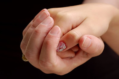
My favorite photograph of hands featured mom and daughter. I tried to go for the idea of Rebecca cradling Hillary's hand:
The family's really not that sentimental, though, so when I asked them what they thought we should do for hands, they went for this:
Which, of course, is "rock, paper, scissors."
On the whole, the assignment was much harder than I thought it would be, even with very willing friends. As a result, I learned a lot! The light on the back deck was not great, but I didn't realize it until I was fully committed to working there. And I think I need a bigger backdrop, if I want to photograph more than two people at a time. I still like the idea of the dry erase boards, although a larger chalk board like the one Tara Whitney has would probably be better. Will have to keep my eye out for one. I also wonder if I should have given them a bit more direction on what to write (Tara told her models to write "a song lyric or something"). I'm not sure how I feel about the picture frame prop. The jury is still out on that one. Maybe I just need a bigger frame. I'd love any feedback you have on these or other props. By the way, check out this link to an article about fads in portrait props that I thought was pretty funny/interesting.
On the other hand, I do want to say that I am very pleased with the basic family portrait I took and am very grateful to have such good friends!
For more ten on the tenth posts, check out Shimelle's blog here (the link doesn't seem to be "live" yet, so you may have to check back later).


![LEAP [into lightroom]](http://learn.kimklassen.com/wp-content/uploads/2015/12/Kim-Klassen_20151223_6459.jpg)


24 comments:
What I notice is how fantastic a photographer Tara W really is, because with my brief wedding photo experiences it is extremely difficult to pose people and groups of people.
I like your first portrait because it looks really natural and I think you nailed the one with Mum and the green frame - perhaps because it is a tight crop?
I also think, and this is what Tara does well, that the photos always turn out better if your subjects are comfortable and in a familiar environment, I would struggle as a subject and as a photographer with the eraser board ones - they can look great but I think it has to be your 'thing' for it to work well.
Lighting is the key isn't it? I also find that the more photos I take in the more varied environments the more I realise I need to practise. I was working on one for the scavenger hunt yesterday and I was focussing on one area and when I got home and uploaded I realised that it was out of context due to my hurried framing ... I'll have to try again soon!
I like the strong blue that you used as the backdrop and the vibrant colours in the frames - more lively than all neutrals.
Glad someone else remembered 10 on the tenth
I rather like the think picture frame one with the three of them. also I think my favourite is Rock Scissors Paper such a fun one that.
I too love the 'Rock, Paper, Scissors' pic...you obviously put them all at ease, as they do look as if they're having fun!
Alison xx
Love the photo frame idea, and the rock paper scissors one is such a fun photo! The hardest part of photographing people is to make them relax and get some natural shots but it looks like you managed that perfectly. You should be very proud of your work!
I love the frame photos, the colours are so gorgeous, really make them stick out.
TFS these, Rinda! I love the blue backdrop against their clothing. I agree about giving guidance with the dry erase boards and would maybe even let them choose the marker color (as long as it showed well). I am very into the use of frames, thinking larger frames or taking the pic with the frame farther from the subject, love the colors. Rock, Paper, Scissors is my fav...great family choice :)
photographing people is always a challenge but you got some great shots! i like the frame idea and think it would look even better in black and white.
I love the backdrop you have used in the 'photo booth' photos. I think they are all great - you are lucky to have such willing friends! I like the picture frames - I think they work well. The dry wipe board is perhaps a little small, but then you wouldn't want the props to totally overwhelm the models.
What a great assignment! I love the photograph with the 3 picture frames.
these are great - i love CJ's classes too.
What a fun way to practice your photography skills. Love the frame photos. Keep up the good work!
you are too hard on yourself, those are great photos, Rinda!!
Mariana in CA
what amazing pictures I love your use of props and that colour choice of blue is so vibrant and just makes your pictures pop x
what amazing pictures I love your use of props and that colour choice of blue is so vibrant and just makes your pictures pop x
Loved the cradled hands photo, though the rock-paper-scissors was definitely fun! I also really liked how you used the frame props...very creative.
What a great class to take! I think your photos turned out fantastic!!! Love the blue backdrop! xoxo
I need to do this~what a great class and fun photos!!!
I've always shied away from portrait photography. When I took pictures of people (which I actually love) it's been casual one, while they were doing something or were engrossed in something etc. I would be nervous with such an assignment that you had here. What you did, though, is stunning - I like your ideas with the background and props and I especially like the outcome.
I have a link for the scavenger hunt not done many yet but thought I would share the ones I have done.
http://craftycreation.blogspot.com/2011/07/photo-scavenger-hunt.html
I realy like the frame ones - they look much more relaxed than the whiteboard nes. Rock,paper scissors is my favourite, although it wouldn't ealy count a a famly portrait
I love the photo frame idea....and really like them.....though 2 frames on 1 person may be a bit too much.....particularly like the 3 of them with frames.
all those photos scream fun to me. I love the ones with frames and also the mother/daughter hands one is lovely.
Great photos - my fav is the rock paper scissors one.
Post a Comment