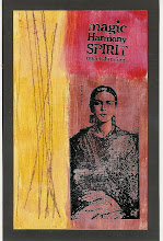
I have to admit that I wasn't that thrilled when the Grungy Monday technique challenge (posted here at Linda's Studio L3 blog) for this week was distress color blocking. Granted, it did come with a cool Tim Holtz video demonstration, which you can see here. But, I don't know. It just seemed so, um, well, plaid to me. But after looking at a few other contributions, I realized that the technique could be done in a more subtle way. Since my art journal has been sad and lonely lately, I decided to give it a go. I started with a Club Scrap mask and spritzed some pesto and terra cotta spray ink around in. Then, I filled the background in, using the color block technique (weathered wood, pine needles and some kind of orange ink). I really like how it turned out. The journaling reads, "It's time to start my summer reading." The image is a picture that I took of a statue in the harbor. Have you tried it yet? Am I only the only one allergic to plaid?


![LEAP [into lightroom]](http://learn.kimklassen.com/wp-content/uploads/2015/12/Kim-Klassen_20151223_6459.jpg)


17 comments:
I have no aversions to a nice plaid, but I'd give it all up to have more of what you've created here!
Amazing! I'm reminded of a mountain pond sparkling with dappled sunshine, and tucked nearby, behind a group of daisies, a tiny cupid carved by a gnome ...
Generally speaking I live these challenges through your blog and your creativity Rinda - I am yet to 'break out' with all this messy play!
I think this one does have a certain tropical feel to it - not what you would generally associate with plaid I suppose!
This certainly doesn't look like plaid to me,Rinda....something I'm not over keen on either...and, like Amy,think it has a real tropical feel to it....enjoy your summer reading.
I think the larger area of orange saves it from being too dull Rinda. I love it & the angel image is cute :)
You are bringing back memories of a pair of plaid trousers I had in the 80's..
Funny, after the water butt post, my brother emailed me and said "I knew no one would know what it was - and watch out, what we call "Check" is called "plaid" across the Atlantic"
I like it - nice subtle effect
It's great Rinda and it does have a tropical feel to it. Great work! Have a wonderful day.
Great take on the technique. I love the way you blended it so well. And the colors are beautiful together. If you haven't read 3MPH by Polly Letofsky - treat yourself. She was the first woman to WALK around the world - over 14000 miles.
I really like how you started with the mask and your background ends up so totally NOT plaid! I'm not allergic to plaid so much, kind of embraced it for my retro card LOL
But loved looking at others and seeing the sutle effects.
The statue photo is so sweet with your journaling!
Way to go with the color blocking! I would say you hit a home run with this one! Love your take on the challenge!
Great post - I was also struggling - my hubby said, "Aawww - it is too much like potato-stamping for you!!!" Then I tried it, and really blended my colours and yes indeed - it comes to life once you build on it... You've made a great journal page and it was a lesson for us both!
Thanks for sharing,
Sarah at 46.
I know what you mean! Some of these challenges I start out with "Really???" and end up thinking: "Wow, Really!" This is a beautiful page and I love the sentiment.
Love it.... Has a great Summer feel to it. Citrus indeed!
i love the photo of the reading cherub. so what is on your summer reading list????
I don't like plaid either, but I like what you made out of using this technique (I watched the video and wasn't that thrilled). What would interest me even more is what acutally IS on your summer reading list!
Funny how we all see different things. I really didn't think of plaid when I saw this technique. I'm not a huge plaid fan myself. You did a great job changing up this technique to make it your own.
Funny, plaid never entered my mind. Your background is warm and brings great depth to your project. Thnaks for sharing.
like you I wasn't initally inspired until I had a go....your has turned out really well
Post a Comment