See that expression? That's a fifteen year old boy who is ecstatic after having scored for the first time playing High School Varsity soccer. In fact, he scored two goals in the first half of the game on Wednesday. Both were headers, courtesy of beautiful crosses from his teammate Miguel. No photo-shopping required!
Here's another kindof cool photograph with no photoshopping:
I love how the soccer players resemble ninjas. I did put my PSE to work creating some 8x10's of the Senior players that we will hand out on Senior Night. Here's some samples:

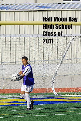 So, I'm looking for some honest feedback on the senior shots. Do you like having the text on them? Did I choose the right color for the text? Are there any you think I need to retake? Do you think this would be a better shot for the goal keeper?
Thanks for your help! I'm going to let this post run for a couple day because I'm going out of town on work for a quick trip to Shrevesport, La. Also, a reminder that if you're interested in participating in "Pass the Book" and spending some time with "Lady Cottington's Pressed Fairy Book," check out this link and post your interest soon.
So, I'm looking for some honest feedback on the senior shots. Do you like having the text on them? Did I choose the right color for the text? Are there any you think I need to retake? Do you think this would be a better shot for the goal keeper?
Thanks for your help! I'm going to let this post run for a couple day because I'm going out of town on work for a quick trip to Shrevesport, La. Also, a reminder that if you're interested in participating in "Pass the Book" and spending some time with "Lady Cottington's Pressed Fairy Book," check out this link and post your interest soon.


![LEAP [into lightroom]](http://learn.kimklassen.com/wp-content/uploads/2015/12/Kim-Klassen_20151223_6459.jpg)


14 comments:
For starters, the shots are all fantastic and I do particularly like the bottom one of the goalie - a great action shot!
I think I prefer the black text on the first couple of shots - I find black or white usually works best but it depends on your vision for the finished project - sometimes a line of text along the top or the bottom can also be effective ... it depends on your available white space :-)
Love the shots and the writing on them. I prefer the 2nd goalie shot.
If you want the text to stand out a bit more one way to provide contrast is to add a glow or stroke - select the text layer, from the layers menu choose layer styles and then add stroke - choose a pale colour for the stroke.
These are fantastic action shots, Rinda! What lens are you using? I prefer the second goalie shot, and I have mixed feelings about the text. I like it on the shots where there's ample white space, not as much when there's not. I like the black text the best, but wonder if white would work on the shots where there's less white space. As a scrapbooker, if my son had been given one of these awesome photos, I would have liked one without text. I think the boys will be glad to have it there. Congrats to Henry on the goals!!!
Some great photos,Rinda....that second goalie shot is great....you can feel the action.
Like Karen....as a scrapbooker.... I'd prefer my photo without text...but I think most of the parents/kids will love having it there.
It's so hard for continuity on individual shots to have the same text on each photo. Sometimes there is not enough white space for it to show up and the text is lost amongst the branches of the trees. Where there is plenty of space, I prefer the black text to be honest, but I think that scrapbooker-ly speaking I would prefer without text. Having said that, it is good to have something on it to document the team and season. Is there a way you could add a small border to each photo maybe just at the bottom, which would hold the text? Just like a customised template? They are all fab photos though, they will be thrilled with them.
i think they all look great! the senior players are going to love getting these. and your son's joy is contagious in the photo you took of him.
These are all such great shots, Rinda! I really do like the text on the photos, but I think the black text is easier to read - especially when it's against a light background. Your son's team is lucky to have you as a soccer mom!
Me too, I love the goalie action shot!! Sorry that I have been absent. Starting to feel better and making the rounds. xoxo tam
Yay for the goals! :-)
The photos are great - and for your purposes, I think it's good to have the text on them. I agree that the text works best when the background is lighter and the text is black. I wonder if the second of the two with orange text would work better if you moved the caption down a bit, over the fence rather than the tree? Though it may not work so well from a composition point of view....
actually i like the goalie shot you used, tho the action shot is cool, i'm afraid that since there is no actual ball in the shot (unless you insert one?) that he looks kinda dorky .. if there were a ball for his kick, i'd say use that one, but even though we KNOW he's kicking a ball.. well.. he's a HS boy, they are strange :) i think the text looks great! you are such a great mom to do all this work!
Mariana in CA
wow! Those are some great photo shots! The action pictures are amazing! Beautiful job! Have a great Sunday!
I also like the second goalie shot & prefer the black text. Like others said I think the text works best where there is ample white space. I think the thing that looks a little off for me is that you have the text broken up in different ways for different photos. But that's just probably because they are all together & it doesn't matter individually.
It's lovely that you're giving these out to the Senior Soccer boys - they will be so pleased!
I do like the second goalie shot, but I prefer the first... there is a ball in it and he's obviously doing his goalie-job.
The text is good, but I don't know about colours - not sure if I like the black on the shot above the goalie ones - it needs a paler border or something.
Still, they are great shots and I think the lads will be proud to have them!
Great shots Rinda and the families will absolutely love getting them. I prefer the black text on the photos. Can you crop the goal keeper a little closer, the rest of the photos seem to be zoomed in a bit more.
Post a Comment