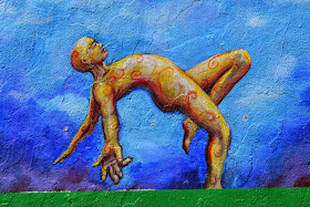
Last week I played tour guide with my friend Jacky, and we visited the murals in the Latino Mission District of San Francisco. I took lots and lots of photos and have some thoughts about them to share, soon. But, in the mean time, I wanted to share this pair as part of Helena's weekly Photography Pairs meme. I'm a few days late, but better late than never!
This mural is on the side of the building which houses Philz Coffee shop, one of the best brews in S.F. I really like the zoomed in version, although the zoomed out probably better captures the intent of the mural artist.


what a pose - I want to put cushion on the floor under his head. amazing shading of colour
ReplyDeleteGosh, that is striking - if a little uneasy-making! But the skill is great and the composition so very unusual, alomst dreamlike. Thank-you for bringing us something we might not otherwise see :).
ReplyDeleteYour photo certainly makes the Zoom In the best of the two, but it's good to see the total painting as well.
ReplyDeleteI like the zoomed in one..but actually I'm thinking that having two versions maybe does fit with the artist's intent. Most of us will see it large first, maybe driving past, and then walk up close for a better look
ReplyDeleteWhat a fun thing for you and Jacky to be able to share!
ReplyDeleteI like the micro version better as well, maybe then I can make my own story to go with it.
ReplyDeleteIt's nice to see the whole mural and how the zoomed in portion fit into it.
ReplyDelete